Thursday, January 29, 2015

GIS Cartography Lab - Week 3

This week in Intro2GIS I used ArcMap 10.2 to create three maps while also learning about the importance of cartography. We can do more than just make maps with ArcMap but maps happen to be one of the most useful ways to share the data that the software helps us sort through. 

The first map I created shows the states of Mexico color-coded by their population size. In creating this map I learned about clipping shapefiles to create smaller datasets. This was a very useful tool because it made editing the symbology much easier to do. I also played around with different color combinations and label sizes to make a map that is easy to read. Some of the tools we learned about for the second map would have been useful for this first one.


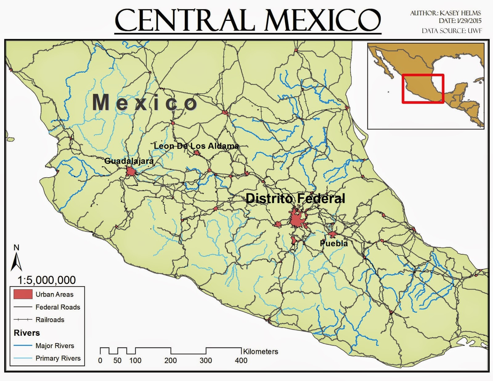
The second map shows large urban areas, rivers, railroads, and major roads in Central Mexico. I used the clipping tool again for this map and modified the symbology so the colors were more in line with cartographic guidelines. The most useful skill I learned while making this map was how to change the labels created from shapefiles into map annotation. This allowed me to move labels and edit them individually in order to make the graphic a little clearer. I also added an inset map for reference because the graphic does not show the whole country of Mexico.


For the third map we took a look at a raster dataset instead of the vector files we worked with for the first two maps. This particular map used the Digital Elevation Model (DEM) for the entire country of Mexico. I looked at two different ways to display the DEM data, stretched and classified. The stretched display (displayed on the map) showed a smooth transition between all of the data values and created a graphic that clearly depicted the terrain features. The classified display color coded the data according to certain sets of values which created a very block-like or pixel-like map. I chose this color scheme to display the elevation of Mexico because it reminded me of the 3D topographic models we had in the library at my elementary school. I also added an extent indicator as a reference for the location of Mexico.

Module 3- Cartographic Design

This week I made a graphic depicting the public schools in Ward 7, Washington D.C. using ArcMap 10.2. Adding features to the map and utilizing multiple layers to display more than one map in the final graphic was pretty simple. The difficult part was employing the cartographic design principles. I had no idea how difficult it could be balancing colors and line sizes until I tried to do it this week. I could have spent an entire day adjusting colors to get the contrast, visual hierarchy, and figure-ground balanced right but I didn’t have that much time on my hands. I am very glad we are doing this using computer software rather than by hand because I am not sure I could draw and erase than many times.


As for the graphic itself, I struggled to find a way to place all of the items so it was appealing. I wanted to place the small map of Washington D.C. in the top left corner and the legend in the bottom left corner but overlapping features was not possible. I also do not like placing a title on the bottom of a graphic but it seemed like the best place for this particular project. I know cartographic design is one area where any practice will be beneficial.

Thursday, January 22, 2015

Module 2- CorelDRAW

This week we were introduced to CorelDRAW. It caused some serious frustration for me but when I finally finished my map graphic I was satisfied with the way things turned out.

Our assignment was to create a map of Florida with certain features marked for a children's encyclopedia. We started by creating a map in ArcMap and finished the project in CorelDRAW. In ArcMap I learned a bit about reparing data sources after files are moved. The major lesson I took away was that sometimes it is easier to just add the file over again instead of trying to repair a broken filepath. A little bit of assistance from other classmates helped me navigate through that issue. Then we exported a .eps file from ArcMap in order to edit it in CorelDRAW.

Now this is where I had to shut my computer and walk away for a little while. When I imported the .eps file into CorelDRAW some of the files did not display correctly. I tried a couple of different things to work through it but my patience was worn thin after battling with repairing filepaths in ArcMAP so I shut the computer and walked away for a while.

With my patience regained I gave CorelDRAW another try but encountered the same problems with point files displaying incorrectly. Fortunately someone else in the class figured out a solution and posted it in our discussion board. After that problem was solved it was on to graphic design. Art is not my forte but I did have fun with this project. I could easily get lost for hours trying to move objects to the perfect spot or creating just the right curve. At the beginning of this assignment I questioned why we could just create the graphic in ArcMap but now I can see that the design opportunities in CorelDRAW just mean map graphics can look that much more user friendly!

Own Your Map - Week 2


This was week two of delving into ArcMap. In the past I had to create map graphics with larger/smaller map call-outs and it was always difficult to find maps that matched or worked well together. Now I can design my own! Our project this week was to create a graphic displaying the location of the University of West Florida campus in relation to Escambia County, FL.

I’m not a graphic designer at this point so the colors and spacing can still use a little work but I was really excited to figure out how to display multiple data frames at one time. It was even more interesting to see how it was possible to edit multiple map frames while they were all displayed in Layout View. I got a little frustrated with zooming and accidentally moving the wrong items but overall this week was not too difficult.

To top it off I was so excited about making my own call-outs I showed one of my friends who works in land acquisition. Her first comment was did you have to draw all those borders yourself? I showed her the shapefiles we were working with and she could not believe how easy it was to manipulate and display them. She used to spend hours drawing map graphics in Adobe Illustrator and was a little jealous of the functions in ArcMap. I'm looking forward to our next project.

Friday, January 16, 2015

Lab 1- ArcGIS Overview Lab


This map was my first creation in my first formal GIS course and I am sure there will be many more to follow.


I am not a big fan of how the scale bar turned out on it but I know there will be plenty of practice with ArcMap to come so I am confident I will figure it out. I am also interested in learning more about editing the legend data and display in this next week because I think it could look better. Besides my battle with the scale bar, the most difficult part of this first lab was just getting comfortable with the eDesktop and realizing how much I need to find the mouse for my laptop. There are so many little things to overlook and that was one that will not be missed again. I am very excited to play with this software and create some excellent map products.

Module 1- Intro to Cartography and Map Critique


This week we looked at the principles of mapping and analyzed a few map graphics. Here are two that stood out to me:
 
Well-Designed Map

The well-designed map I chose depicts the Wildlife Management Area Game Zones of South Carolina. The zones are clearly communicated with minimal extra information. The legend and labels are color coded which makes the zones easy to identify. Basic map information like orientation, scale, data source, and date of creation are all included in space that does not clutter the map. The layout is appealing to look at and the placement of the labels around the map graphic is not distracting. In order to ensure the map is simple only the essential information was included but there is a note with a website in case you need more information. In all, I think this map meets the majority of the mapping principles we learned about during this module.


Poorly-Designed Map

The poorly designed map I chose depicts the location settings for sitcoms in the United States. At first I thought this map showed the filming locations for sitcoms until I began to recognize some of the shows. The data on this map is confusing because it is not directly linked to the cities it is connected with. There are very few city names noted on the map and no states are identified which creates some confusion. I think boxes with filled with show titles or call outs with arrows pointing to city names would have been more effective. This map is also a little misleading because some show titles cross over multiple states or are written completely in the wrong state because of the limited space. This map does not meet the principles of clear labeling, explaining the data on the graphic itself, or clear presentation and design.