Thursday, April 30, 2015

Intro to GIS Final!

The final project for Intro2GIS was a tough one! It took every skill I learned over the course to finish it. From projections to create a geodatabase and hunting through metadata, every task was required for this project. In the end I created a presentation to look at four different aspects of concern for the placement of the new Bobwhite-Manatee Transmission Line in Manatee and Sarasota Florida.

One of the first challenges with this project was coming up with a plan for how to tackle it. That plan took the form of a cartographic model.
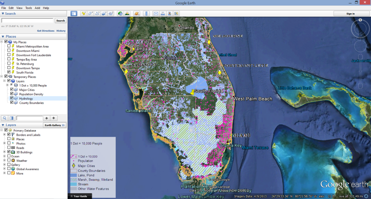
After the plan was made, reviewing the data was the next task. But before the could start, i had to make sure all of the data was projected the same way and the map units in ArcMap were consistent with the spatial references that were used. Let's just say I had to go and change a few things because I did not catch this right away and I could not figure out why my map scale seemed so wrong. Once all of that was sorted it was time to edit and analyze the data. This took a bit of time as it included clipping data, creating data, and researching more about the data. Here is a glimpse at the basemap I created with the study area for the project highlighted.
Basemap for Transmission Line Project

The final presentation can be found here Final Presentation - Bobwhite-Manatee Transmission Line
Te commentary to accompany the slides can be found here Slide Commentary - Bobwhite - Manatee Transmission Line

Wednesday, April 29, 2015

Cartography Final! - ACT tests in America

The purpose of this project was to create a map graphic clearly showing the average ACT test scores and percentage of high school graduates who took the ACT exam in each state. Utilizing ArcGIS and CorelDraw software, the data tables available on the ACT website were converted to spatial data and displayed on a map instead of in a table. The shapefiles for the basemap were acquired from the U.S. Census Bureau website. This project was designed to challenge us to use the cartographic principles we learned over the course and add our our personal touches.

As far as how I chose to classify and display the data, the average test score by state was not classified as I thought it was important for the map viewer to be able to identify each state’s score and compare it with others. The average ACT score was placed inside each state or offset with an indicator marking depending on the size of the state. The percentage of graduates tested by state were classified into ten groups manually using increments of 10%. These increments are easy to understand and provide the map readers with a simple way to compare states. This dataset was used to create a choropleth map displayed with a red to green color ramp with red being the lowest rate of participants.
            
During the creation of this map I tried several classification methods and displays including the use of proportional symbols and 3D visualization. I originially thought a choropleth map with proportional symbols or 3D extrusion would create a nice picture but after creating these different display I decided otherwise. The data for the percentage of graduates tested provided a wide range of values which made some symbols very small, like Maine with 8%, while other states like Tennessee were at 100%. In order to make the size of the proportional symbols discernable on the map some symbols crossed state lines while some were barely visible. Using the state’s average test scores also proved to be difficult with proportional symbolization because the range between score was very small, only 18.9-23.8. The 3D visualization hid some data no matter what map angle was presented so no 3D effects were used in the final map.

In the end, the 2D choropleth map was created using the data for the percentage of graduates tested with a red to green color ramp. The average test scores for each state were place on top of the choropleth map, centered in their respective states (with some placed outside due to size issues). A text box with information about national averages was added to the graphic to ensure map viewer could compare their state’s data with other states as well as the nation overall.


Before this class I did not realize how difficult it is to create a simple map. A complex map filled with data, shapes, colors, and words is simple but it is hard to keep all of that information on a simple map. I also do not think I will ever look at fonts the same way and I know I will have to print out a sample page with about 30 of my favorite fonts so i can make notes about when to use each one. Choosing the right font has been one of the most tedious aspects of this class and I never would have guessed that at the beginning.

Sunday, April 12, 2015

Module 12- Google Earth Conversions and Tours

This week in Cartography I tried my hand at Google Earth. Of course this was after working in ArcMap 10.2 and prepping the files for conversion to KML. I took my old dot density map in ArcMap from Module 10 (the one whose legend took longer to create than the map itself) and cleaned up the Table of Contents and symbology before attempting the conversion. In the lab we were also given the option of using a map package provided by the instructor but I figured since I spent so much time on those darn dots I would use my own map.

Google Earth Screenshot
Once my map was configured the way I wanted it I was ready to try the conversion. The tools are in ArcToolbox> Conversion Tools> To KML> Map to KML or Layer to KML. The first conversion I conducted was a Map to KML and I transformed all of the feature classes used in the dot density map to raster files. This prodects the files from a lot of editing changes in Google Earth and makes the files smaller. The converted file can be seen in the screenshot above under the Table of Contents>Places>Temporary Places>Layers. I also conducted a Layer to KML conversion using a shapefile marking the county boundaries in Southern Florida. This file was maintained as a vector file which created a few more options for editing it once it was opened in Google Earth. The editing in Google Earth (the free version) is not as all encompassing as ArcMap but they do give you a few options like changing fill colors and line widths. The vector file also retains the attribute data from ArcMap which can be viewed by clicking on the county polygons in when the file is open in Google Earth.

After converting the files and exploring Google Earth for a bit I added Placemarks to my map and Recorded a Tour. This was a pretty neat feature but I wish I could have figured out a way to pause the recording to turn features on and off. I must have recorded at least 12 tours just trying to figure out where to set the snapshot views for each place mark and when to turn layers on and off.  Overall I enjoyed this week's lab but I like the more dynamic features of ArcGIS better than Google Earth.

Week 13- Georeferencing

The focus for this week in Intro2GIS was georeferencing and editing existing feature classes with a touch of 3D mapping. I used the Georeferencing toolbar in ArcMap 10.2 to georeference two aerial images of the UWF Campus based on the spatial references of an existing polygon and road feature classes. I matched known building corners and intersections from the feature classes with the buildings on the images and with a little help from a 2nd order polynomial transformation to account for distortion was able to spatially align both images.

After giving the images spatial references I used the Editor toolbar in ArcMap to add a building to the polygon feature class and to add a road segment to the line feature class. I addition to the drawing the new items I also used the Editor toolbar to update the attributes for the new items. This was an important step because the height attributes for the buildings came in to play during the creation of the 3D map at the end of the lab. Before moving on to the 3D section I practiced using one more new tool this week, the Multiple Rings Buffer (found in ArcToolbox under Analysis Tools>Proximity>Multiple Rings Buffer). I used this tool to display two buffer distances around the location of an eagle nest near the UWF Campus.

When all of the work was completed in ArcMap I opened up ArcScene to get a 3D perspective of the same areas. The aerial images are draped over a digital elevation model raster with their base heights set to the raster data. The building are extruded using their height listed in the file's attribute table and the whole map has a vertical exaggeration of 5 to enhance the features because the area is so flat.

There were a lot of tools and functions to work with this week but overall they were pretty simple to use. More importantly, the editing and georeferencing tools will be invaluable as I continue in this GIS adventure and I find myself working with new, incomplete, or incorrect data.


Saturday, April 4, 2015

Module 11 - 3D Mapping

This week was an exploration in 3D mapping primarily using ArcScene. The majority of this week's lab consisted of completing the ESRI 3D Visualization Techniques Using ArcGIS Course. The course started with an introduction to 3D data and quickly moved in to how to use/display it. It began with adjusting the base heights of elements and continued on to include vertical exaggeration, extrusion, illumination, rendering, and draping. My favorite screen capture from the week is below. The graphic shows a 3D depiction of Santa Barbara Island (one of the Channel Islands) with a horizon line. I though this was really interesting as the ocean is actually a large circular polygon layered underneath the island and the sky is really the background color of the map. The viewing angle makes it look like a horizon line and the illumination settings create shadows on the backside of the island.

Just as I was beginning to think about how awesome it would be to create more 3D maps I had to answer the last questions in our lab assignment comparing a 2D map (http://en.wikipedia.org/wiki/Charles_Joseph_Minard#/media/File:Minard.png) and a 3D map (http://www.arcgis.com/home/item.html?id=2b48caaabd0e44028724c5f109f3de97) of of Napolean's Russian Campaign of 1812. In my opinion the 2D map is a better way to display this particular information. But this made me think about how I could get very excited about displaying a dataset when the best way to show it might be a much more simple graphic. Technology is amazing but sometimes it provides room for more creativity than everyone else can follow. I also thought the typography in the 2D map was key in the clarity of that map.

Thursday, April 2, 2015

Week 12 - Geocoding and Network Analysis

This week I tackled my introduction to geocoding and network analysis. I have found a lot of topics interesting during this class but this one definitely intrigued me more than most. In my past experience as an intelligence analyst I wanted access to tools like the ones I tried out this week and more importantly, the knowledge of how to use and adapt them to my particular projects. I was able to use bits and pieces of this information previously but everything makes a lot more sense now. I almost want to to back and share this information with some of the folks I used to work with, I just don't want to have to go over the last ten weeks of this course with them as well.

The graphic this week depicts the EMS locations in Lake County, FL that I geocoded using a spreadsheet of addresses, an All Lines Tiger file from the U.S. Census Bureau, and an address locator in ArcMap. There were a couple of locations that had to be manually matched with an address and I used Google Earth to help me with those. The route depicted in the inset map was created using the Network Analyst Extension Tool in ArcMap. I picked the three locations and the computer found the quickest route between the three in the sequence I choose. This is similar to choosing a cross country route with the assistance of Google Maps only it can be applied to all types of undirected networks.

I also had my first experience with model building this week. It was really an exercise in model element identification and correction because I was provided with a partially complete model to start with. I followed the ESRI modeling building course and by the end I had a functioning model to work with in ArcMap. I did not create a graphic based off of the model outputs but i do have a screen shot of the model itself. One important thing I learned this week when it comes to sharing models is that the input and output locations for every tool must be corrected to your own particular file paths. Even if you have the same data and data structure as the original model, the file path names and drives have to be corrected or the model will not run the full process.