Showing posts with label Cartography. Show all posts

Wednesday, April 29, 2015

Cartography Final! - ACT tests in America

The purpose of this project was to create a map graphic clearly showing the average ACT test scores and percentage of high school graduates who took the ACT exam in each state. Utilizing ArcGIS and CorelDraw software, the data tables available on the ACT website were converted to spatial data and displayed on a map instead of in a table. The shapefiles for the basemap were acquired from the U.S. Census Bureau website. This project was designed to challenge us to use the cartographic principles we learned over the course and add our our personal touches.

As far as how I chose to classify and display the data, the average test score by state was not classified as I thought it was important for the map viewer to be able to identify each state’s score and compare it with others. The average ACT score was placed inside each state or offset with an indicator marking depending on the size of the state. The percentage of graduates tested by state were classified into ten groups manually using increments of 10%. These increments are easy to understand and provide the map readers with a simple way to compare states. This dataset was used to create a choropleth map displayed with a red to green color ramp with red being the lowest rate of participants.
            
During the creation of this map I tried several classification methods and displays including the use of proportional symbols and 3D visualization. I originially thought a choropleth map with proportional symbols or 3D extrusion would create a nice picture but after creating these different display I decided otherwise. The data for the percentage of graduates tested provided a wide range of values which made some symbols very small, like Maine with 8%, while other states like Tennessee were at 100%. In order to make the size of the proportional symbols discernable on the map some symbols crossed state lines while some were barely visible. Using the state’s average test scores also proved to be difficult with proportional symbolization because the range between score was very small, only 18.9-23.8. The 3D visualization hid some data no matter what map angle was presented so no 3D effects were used in the final map.

In the end, the 2D choropleth map was created using the data for the percentage of graduates tested with a red to green color ramp. The average test scores for each state were place on top of the choropleth map, centered in their respective states (with some placed outside due to size issues). A text box with information about national averages was added to the graphic to ensure map viewer could compare their state’s data with other states as well as the nation overall.


Before this class I did not realize how difficult it is to create a simple map. A complex map filled with data, shapes, colors, and words is simple but it is hard to keep all of that information on a simple map. I also do not think I will ever look at fonts the same way and I know I will have to print out a sample page with about 30 of my favorite fonts so i can make notes about when to use each one. Choosing the right font has been one of the most tedious aspects of this class and I never would have guessed that at the beginning.

Sunday, April 12, 2015

Module 12- Google Earth Conversions and Tours

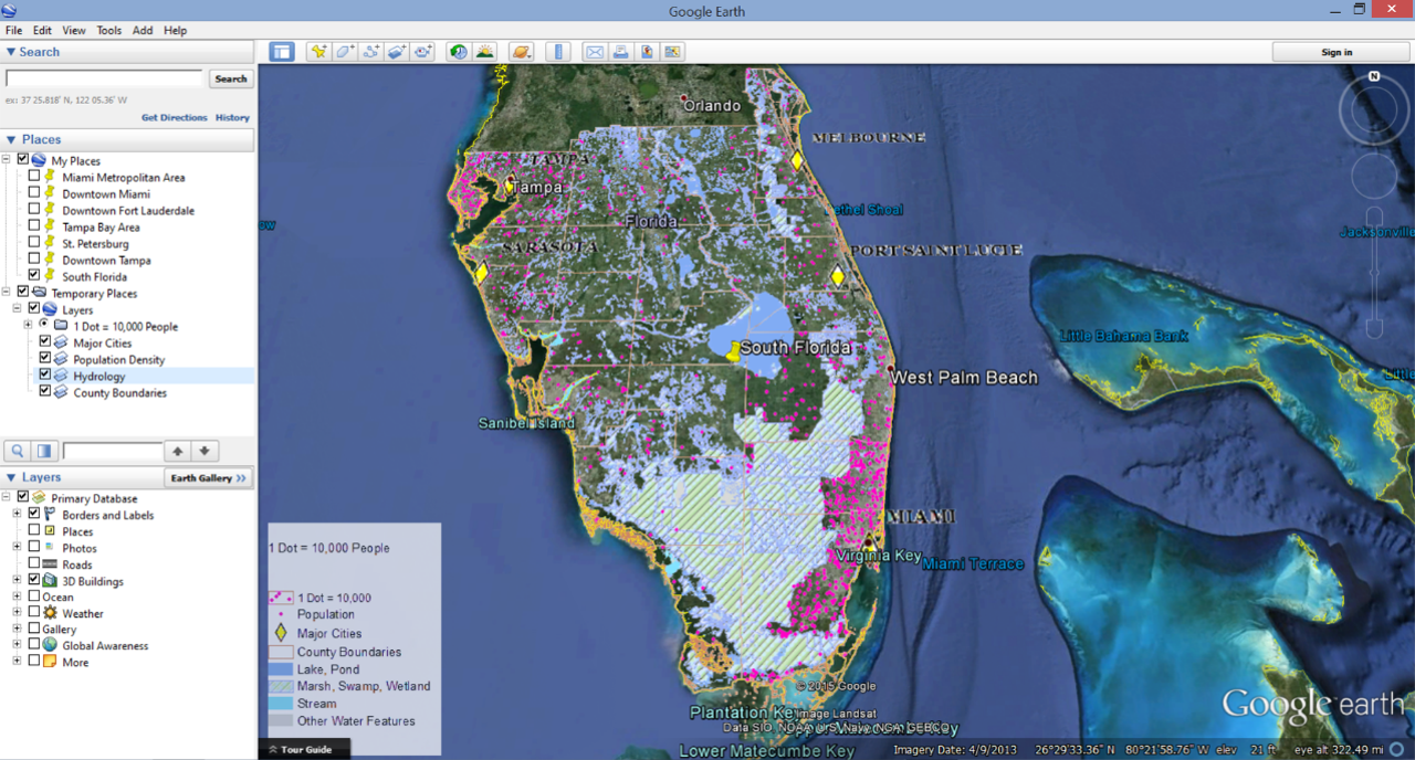
This week in Cartography I tried my hand at Google Earth. Of course this was after working in ArcMap 10.2 and prepping the files for conversion to KML. I took my old dot density map in ArcMap from Module 10 (the one whose legend took longer to create than the map itself) and cleaned up the Table of Contents and symbology before attempting the conversion. In the lab we were also given the option of using a map package provided by the instructor but I figured since I spent so much time on those darn dots I would use my own map.

Google Earth Screenshot
Once my map was configured the way I wanted it I was ready to try the conversion. The tools are in ArcToolbox> Conversion Tools> To KML> Map to KML or Layer to KML. The first conversion I conducted was a Map to KML and I transformed all of the feature classes used in the dot density map to raster files. This prodects the files from a lot of editing changes in Google Earth and makes the files smaller. The converted file can be seen in the screenshot above under the Table of Contents>Places>Temporary Places>Layers. I also conducted a Layer to KML conversion using a shapefile marking the county boundaries in Southern Florida. This file was maintained as a vector file which created a few more options for editing it once it was opened in Google Earth. The editing in Google Earth (the free version) is not as all encompassing as ArcMap but they do give you a few options like changing fill colors and line widths. The vector file also retains the attribute data from ArcMap which can be viewed by clicking on the county polygons in when the file is open in Google Earth.

After converting the files and exploring Google Earth for a bit I added Placemarks to my map and Recorded a Tour. This was a pretty neat feature but I wish I could have figured out a way to pause the recording to turn features on and off. I must have recorded at least 12 tours just trying to figure out where to set the snapshot views for each place mark and when to turn layers on and off.  Overall I enjoyed this week's lab but I like the more dynamic features of ArcGIS better than Google Earth.

Saturday, April 4, 2015

Module 11 - 3D Mapping

This week was an exploration in 3D mapping primarily using ArcScene. The majority of this week's lab consisted of completing the ESRI 3D Visualization Techniques Using ArcGIS Course. The course started with an introduction to 3D data and quickly moved in to how to use/display it. It began with adjusting the base heights of elements and continued on to include vertical exaggeration, extrusion, illumination, rendering, and draping. My favorite screen capture from the week is below. The graphic shows a 3D depiction of Santa Barbara Island (one of the Channel Islands) with a horizon line. I though this was really interesting as the ocean is actually a large circular polygon layered underneath the island and the sky is really the background color of the map. The viewing angle makes it look like a horizon line and the illumination settings create shadows on the backside of the island.

Just as I was beginning to think about how awesome it would be to create more 3D maps I had to answer the last questions in our lab assignment comparing a 2D map (http://en.wikipedia.org/wiki/Charles_Joseph_Minard#/media/File:Minard.png) and a 3D map (http://www.arcgis.com/home/item.html?id=2b48caaabd0e44028724c5f109f3de97) of of Napolean's Russian Campaign of 1812. In my opinion the 2D map is a better way to display this particular information. But this made me think about how I could get very excited about displaying a dataset when the best way to show it might be a much more simple graphic. Technology is amazing but sometimes it provides room for more creativity than everyone else can follow. I also thought the typography in the 2D map was key in the clarity of that map.

Friday, March 27, 2015

Module 10- Dot Mapping

Dot Maps. I have seen plenty of them but I had no idea what went into making one until this week. I used ArcMap 10.2 to create a dot map to display the population density in Southern Florida and in general the project was pretty simple. The symbology display options and statistical tools in ArcMap significantly reduce the amount of work required to count and place dots on a map when the data is already included in a file's attributes. The real work for me was working with cartographic principles, specifically color schemes.

 To create the dot density map I displayed the shapefile I was working with using the Dot Density option hidden in the file's Properties under the Symbology tab. It took a little while to decide which dot size and dot value to use because the clarity of the dots changed as I zoomed in and out of the map and it took me a while to realize this. Eventually I settled with a dot size of 2 and a dot value of 10,000. I was able to adjust the placement of the dots (excluding certain areas like large water features) by using the Properties option within the Dot Density window. As a note to anyone who wants to use this feature, it does not work well if you turn these options on and off several time so save your map often.

Aside from ArcMap being a little finicky the map was not difficult to make. The difficult part was finding a color scheme that worked well with all of the required map information. I had to include multiple water features that needed to be displayed in blues and greens. This major use of blues and greens washed out most of the other color options for the dots and since they are the most important feature, they need to stand out. I tried several bright colors and dark colors but the only dot color that stood out well against all of the water features was a bright pink. I even made most of the other features on the map partially transparent but pink was the only color that seemed to work.

Friday, March 20, 2015

Module 9- Flow Mapping

This week I created another thematic map and the focus continued to be on design. I created a distributive flow map depicting the worldwide immigration flow into the United States using statistics from 2007.
We were provided with outlines for both the world map and the associated scale bar in a .cdr file to work with in CorelDRAW 7. The initial graphic also included the U.S. Map and scale bar. All of the editing this week was completed in Corel so maintaining map scale while moving elements around was crucial. 

The major topic this week was flow mapping which is why the world map with flow lines is the largest element in my graphic. All of the flow lines are proportional to the amounts of immigrants flowing from each continent. Originally I planned on only using black flow lines but with the overlapping lines I decided that using colors made the map a little easier to follow. I also added a drop shadow to all of the lines to make them stand out against the background without distracting from the map like a bold solid outline would. The background is an elliptical fountain fill instead of a solid fill because it helped balance the different shades of light colors on the map.

The inset map is a choropleth map depicting the percent of immigrants per state. I only applied minimal changes to the choropleth map, primarily adjusting the location of Alaska and Hawaii so everything would fit inside the neatline. I created the legend for the inset map solely using Corel. I thought this would be one of the more difficult aspects of this week's lab but quickly found out how simple it could be. With the help of the color dropper tool to identify fill colors the legend only took about a two minutes to create. I cannot say the same about the drop shadows around the flow lines because they took me at least an hour to adjust. 

Friday, March 6, 2015

Module 8- Isarithmic Maps

This week covered isarithmic maps and I have to say this was my favorite section so far. I'm not sure if it was the weatherman aspect or the fact that this topic was easy to understand but I definitely enjoyed it. For the my lab I used ArcMap to create two maps depicting the average rainfall in Washington using the same precipitation raster dataset. The raster data came from the U.S. Department of Agriculture but was originally produced by the PRISM Group out of the University of Oregon. PRISM is an analytic method used to interpolate point data including the climatological affects of terrain features. This means the precipitation values that were assessed for areas without measuring points were based off of surrounding precipitation measurements as well as the mountains and hills in the region.

The first map displays the data using continuous tone shading. The shading was done using Stretched Symbolgy with the precipitation color ramp in the data's properties. I think this map is better suited for displaying the precipitation values because the changes look natural and smooth. As for the graphic, I used a dark background with light text because it was easier to see the edges of the map against the dark colors; all of the colors besides the map itself are somewhere in the gray scale.

Continuous Tone
The second map displays the precipitation data using hypsometric tinting with contour lines. I created the hypsometric tinting by using a Classified Symbology with the precipitation color ramp in the data's properties. I created ten classes and manually set the class boundaries. This created a map with color blocks of related colors. After classifying the data I also created contour lines using the Contour List Tool in the ArcToolbox. This tool requires the Spatial Analyst Extension to be enabled before you can use it but once it is turned on, it is fairly easy to use. To create the contour lines you simply add the original raster data to the Input section, select the Output location (place to save it), and then add the values you want contour lines drawn at. My contour lines were drawn at the class boundaries for the hypsometric tinting which makes the color changes even more defined.
 
Hypsometric Tinting with Contour Lines
Both maps also use a hillshade to give an idea of what the terrain looks like. I think that is important for these graphics because the dataset was interpolated with respect to these features.

Friday, February 27, 2015

Module 7 - Choropleths

This week I created choropleths for the cartography lab. Everyone has seen a map like this but I doubt anyone actually knows what they are called, except for cartographers and other GIS nerds. At first glance choropleths seem simple and appealing to look at, at least in my opinion, but when you start working on one you realize just how complicated they can be. The most interesting facet for me was how easy it can be to lie using one of these maps. Using the right groupings or minor differentiation in color can hide all types of details that people might want to know and map makers can be real tricksters by using different methods of classification on one map. While creating the map graphic I also accepted the fact that statistics and I will become best friends much sooner than later.


My map for the week shows several population statistics for European countries including wine consumption. I utilized multiple layers in ArcMap to symbolize the same shapefile in several different ways. The large map shows population density and wine consumption rates. The population density is classified by quantiles and the wine consumption is classified by natural breaks. The female and male percentages by country are classified using natural breaks as well. All of the classifying was done within the Symbolgy Tab of the Properties for each shapefile. I viewed different methods for classifying the data including standard deviation, equal interval, manual in addition to the methods pictured. I also explored the difference between graduated and proportional symbols for the wine consumption icons but decided on graduated symbols as the display for classified data was easier to understand. 

Choosing color schemes was a whole different project for this lab. For me, sequential color schemes are difficult to differentiate no matter the hue. The various shades of color also made it difficult to find an appropriate background color. I even tried to set the page background to black and use white text in hopes that it would help me differentiate the lighter shades on the graphic but it was not successful so I reverted back to the white page. Every week I experience more of the tiny details that go in to making a map and I can say that choosing colors and fonts are becoming some of the most time consuming parts.

Friday, February 20, 2015

Module 6- Data Classification

This week was a little simpler than some of the weeks as the lab was centered on classifying data rather than learning graphic design software. We took another trip down memory lane and looked at statistics again. This time the focus was on determining the best way to classify a particular data so it could be accurately represented and easily understood by a map reader. The maps below show different classification methods for census data in Escambia County, Florida.

To create this graphic I used ArcMap and worked with the same shapefile in four separate layers. Each layer was classified by Quantities using Graduated Colors within the Properties of the shapefile. All of the classification methods depicted in the graphic are available as options in a drop-down menu with several other options not shown in the graphic. As for the color choice, at first I was unhappy with every choice of color ramp in ArcMap because the distinction between boundaries was a little unclear. Finally after choosing a darker color ramp and changing the outline to a light gray I think it turned out alright. The other thing I had to be careful with this week was the scale bar because there were so many different maps on one page. Before adding the scale bar I adjusted each map to a 1:800,000 scale in order to get a scale bar with numbers that were easy to work with.


*As side note, I even though I had my arguments with CorelDraw7 over the last few weeks, I decided it was the easiest way to add the text paths I needed for my graphic in Intro2GIS this week.

Thursday, February 12, 2015

Module 5 - Spatial Statistics

Whoever thought statistics was fun was wrong. Fortunately ESRI made a set a spatial analyst tools for ArcMap that makes the work a little easier. In Module 5 for Cartography we took a look at spatial statistical analysis. I remember taking statistics. I remember thinking how useful statistics could be and how excited I was to learn to apply some of that math to may day job as an analyst. I also remember how overwhelmed I got at the end of the class and how I wished statistics never went beyond the point of standard deviation and normal distribution. Fast forward to today and now I'm back to thinking how cool statistics can be because the tools we learned about this week made the work much easier.

For our lab we followed an ESRI course (Exploring Spatial Patterns in Your Data Using ArcGIS) and spatially analyzed some of the attributes of a vector point file. For the graphic below we looked at weather stations in Western Europe and the temperatures they reported. The graphic simply displays the locations of the weather stations, the mean location, the median location, and the directional distribution of the locations. The great part is that I did not have to do any of the math behind the scenes to create the graphic because the Spatial Statistics Tools and the Geostatistical Analyst Toolbar did all of the hard work for me.
The Spatial Statistics Tools made finding the mean, median, and directional distribution of the weather stations easy because it was all done with the click of a button. Simply pick the tool you want to use, input the file you want to analyze, and click okay. The tool will process all of the data and create a new file displaying the statistic you chose.

What's not pictured in the graphic above is all of the other statistical analysis that the software can do. Using the  Geostatistical Analyst Toolbar I created a histogram, a normal qq plot, a voronoi map, a semivariogram/covariance cloud, a crosscovariance cloud, and a 3D trend line. My two favorite tools from the week were the histogram and the voronoi map. The histogram was something I easily recognized and am comfortable using and the voronoi map was really interesting. The polygon and color distribution of the voronoi map was much more intuitive for me than looking at a bunch of numbers and I think it will be a useful tool when trying to create graphics to explain statistic that I have to analyze.

Friday, February 6, 2015

Module 4-Typography

This week was another adventure with CorelDraw7 but include a hard lesson in the value of different fonts as the main focus was typography. I call it an adventure because it really tests my patience until I am practically done with the project and then there is an ah-ha moment and I completely appreciate the software. The task this time around was to create a map of Marathon Key, Florida from a basic Adobe Illustrator file that contained the outline of the landmass.

 I struggled with the labeling for hours until I finally understood how to utilize the layers feature in Corel. After setting up different layers for water features, islands, the legend, essential map elements, and the map itself the project was much easier to complete. I turned off certain elements while editing others and used the visibility function when trying to select particular features that were difficult to click on.

Aside from just learning the software a little better, my favorite part of this exercise was creating my own little shape in order to depict the whole area of Curry Hammock State Park. I'm pretty proud of that green little polygon. I am no graphic designer but I truly do appreciate all of the work that goes into designing little maps on the back of pamphlets all the way through huge charts that take up a whole wall. This stuff is not easy.

Thursday, January 29, 2015

Module 3- Cartographic Design

This week I made a graphic depicting the public schools in Ward 7, Washington D.C. using ArcMap 10.2. Adding features to the map and utilizing multiple layers to display more than one map in the final graphic was pretty simple. The difficult part was employing the cartographic design principles. I had no idea how difficult it could be balancing colors and line sizes until I tried to do it this week. I could have spent an entire day adjusting colors to get the contrast, visual hierarchy, and figure-ground balanced right but I didn’t have that much time on my hands. I am very glad we are doing this using computer software rather than by hand because I am not sure I could draw and erase than many times.


As for the graphic itself, I struggled to find a way to place all of the items so it was appealing. I wanted to place the small map of Washington D.C. in the top left corner and the legend in the bottom left corner but overlapping features was not possible. I also do not like placing a title on the bottom of a graphic but it seemed like the best place for this particular project. I know cartographic design is one area where any practice will be beneficial.

Thursday, January 22, 2015

Module 2- CorelDRAW

This week we were introduced to CorelDRAW. It caused some serious frustration for me but when I finally finished my map graphic I was satisfied with the way things turned out.

Our assignment was to create a map of Florida with certain features marked for a children's encyclopedia. We started by creating a map in ArcMap and finished the project in CorelDRAW. In ArcMap I learned a bit about reparing data sources after files are moved. The major lesson I took away was that sometimes it is easier to just add the file over again instead of trying to repair a broken filepath. A little bit of assistance from other classmates helped me navigate through that issue. Then we exported a .eps file from ArcMap in order to edit it in CorelDRAW.

Now this is where I had to shut my computer and walk away for a little while. When I imported the .eps file into CorelDRAW some of the files did not display correctly. I tried a couple of different things to work through it but my patience was worn thin after battling with repairing filepaths in ArcMAP so I shut the computer and walked away for a while.

With my patience regained I gave CorelDRAW another try but encountered the same problems with point files displaying incorrectly. Fortunately someone else in the class figured out a solution and posted it in our discussion board. After that problem was solved it was on to graphic design. Art is not my forte but I did have fun with this project. I could easily get lost for hours trying to move objects to the perfect spot or creating just the right curve. At the beginning of this assignment I questioned why we could just create the graphic in ArcMap but now I can see that the design opportunities in CorelDRAW just mean map graphics can look that much more user friendly!

Friday, January 16, 2015

Module 1- Intro to Cartography and Map Critique


This week we looked at the principles of mapping and analyzed a few map graphics. Here are two that stood out to me:
 
Well-Designed Map

The well-designed map I chose depicts the Wildlife Management Area Game Zones of South Carolina. The zones are clearly communicated with minimal extra information. The legend and labels are color coded which makes the zones easy to identify. Basic map information like orientation, scale, data source, and date of creation are all included in space that does not clutter the map. The layout is appealing to look at and the placement of the labels around the map graphic is not distracting. In order to ensure the map is simple only the essential information was included but there is a note with a website in case you need more information. In all, I think this map meets the majority of the mapping principles we learned about during this module.


Poorly-Designed Map

The poorly designed map I chose depicts the location settings for sitcoms in the United States. At first I thought this map showed the filming locations for sitcoms until I began to recognize some of the shows. The data on this map is confusing because it is not directly linked to the cities it is connected with. There are very few city names noted on the map and no states are identified which creates some confusion. I think boxes with filled with show titles or call outs with arrows pointing to city names would have been more effective. This map is also a little misleading because some show titles cross over multiple states or are written completely in the wrong state because of the limited space. This map does not meet the principles of clear labeling, explaining the data on the graphic itself, or clear presentation and design.


Week 1-Meet Your Classmates!

My name is Kasey Helms and I just finished eight years in the Navy. I spent my last year living in Bahrain and completing my BS in Environmental Studies. I returned to Virginia at the end of December and now I am packing up my things so I can move back to Southern California at the end of the month. I have two dogs that love the beach and paddle boarding so I spend a lot of my free time around the water.
In the Navy I worked as a military intelligence analyst and that is how I was first introduced to GIS. Playing with ArcGIS became one of my favorite ways to pass time on deployment. I enrolled in this program because I want to transition into a civilian job in the GIS or analyst field and it never hurts to have some formal training. Someday I hope to create more user friendly GIS applications because I know the software and data can be really useful but many people have no idea how to use it. 
I made my story map about my time in Bahrain. Here is the link- http://bit.ly/1DWAtud